Soft Brutalism
FALL 2023 CAMPAIGN
Client: Maiden Home
Creative Director: Lenay Johnson
Art Direction: Natasha Louise King
Styling: Mariana Marcki
Photographer: Christopher Sterman


OVERVIEW
For Fall 2023, we were driven by a modern-day interpretation of brutalist design—blending reverence for honest materials and heritage craftsmanship with the softer side of shape and form.
MY SCOPE
-
CREATIVE STRATEGY
-
EDITORIAL CONCEPT & COPY
-
PHOTOSHOOTS (STUDIO & LIFESTYLE)
-
POST PRODUCTION
-
ASSET STRATEGY
-
USER EXPERIENCE
-
PRODUCT STORYTELLING
-
DESIGN DIRECTION
-
BUDGET
-
CREATIVE TEAM MANAGEMENT


NARRATIVE CONCEPT
Much like the origins of brutalist design, the Fall 2023 Collection was rooted in the essentials—a focus on materiality and intentional forms. With over 14 new furniture pieces spanning from design-forward to classic, the introduction of a new wood species with bespoke finishes, and the release of a high-end Belgian linen, the challenge was to create a robust narrative concept for the season with newness at the forefront.
VISUAL CONCEPT
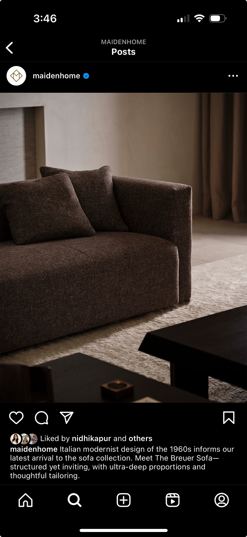
Beauty is found more and more in the smallest of details as our furniture design has evolved. As such, we wanted to introduce a more dramatic style to our photography direction through lighting, styling, and art direction. Working with a team of incredible talent, we were able to produce a suite of campaign and product imagery that was evocative and dramatic, lending an edginess to the simplicity of the designs while still providing the customer with information both compelling and informative on the collection.


"
In celebration of heritage craftsmanship, our latest collection evokes the essentials—beauty in form and truth to materials. Minimal, graphic shapes meet supple Belgian linens, solid white oak, and touches of aged brass, for a display of subtle luxury in true form.
LIFESTYLE PHOTOGRAPHY
The luxury of this collection was shown in the massive forms and richly textured materials. The challenge was to find a location that was quiet enough to let the pieces take center stage but provide texture, drama, and mood as setting. The styling was simple, yet compelling to echo the collection. Lighting played a starring role, with three levels of drama catered specifically to each shot.
STUDIO PHOTOGRAPHY
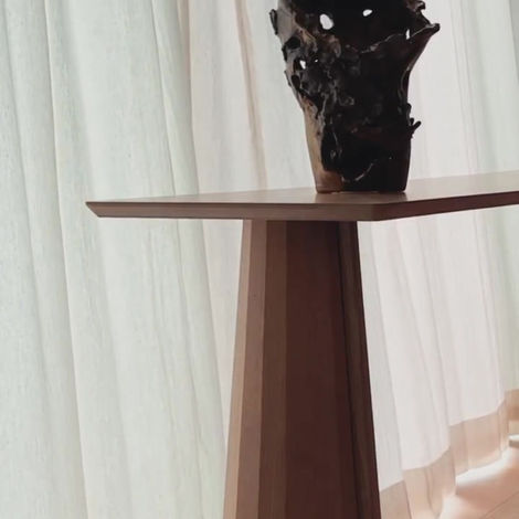
Previously, our studio photography was developed primarily for website PDPs. I’ve pushed our creative direction to be able to utilize this precious studio time to not only achieve successful product photography but to also capitalize on tight product details as dramatic editorial moments. This not only gives informative detail of the product, but provides a compelling shot for use in social, email, and content campaigns.


CAMPAIGN PRODUCTION, DESIGN & COPY
To echo the dramatic simplicity of the photo assets, the design and layout direction prioritized negative space and utilized our sans serif type. The copy was pared back, leaning on a tone of quiet confidence.


HOMEPAGE
SELECT EMAILS


LANDING PAGE


SELECT SOCIAL


BTS


